Anyway, these are the explanations which I gave for the logo.
When it comes to logo designing, there are plenty of ways to create the symbolic image that one wants. The most conventional way is to design a simple picture or diagram that represents whatsoever it should, and then have the name of what it represents written somewhere near the picture (and maybe including a tagline of some sort). Another way is to simply write out the name in an artistic, special or weird font. Such designs should be consisted of 5 colors or less. Well… that is the conventional way…
For our ‘Shawprano’ logo, I did not follow such rules which many MMCs have used for their logos. One thing is that this logo will only appear for a few times, so who cares if its simple or distinctive in whatsoever sense? Another thing is that this logo might be used for t-shirt designs or something in the future, and so the more it should be complicated and expressive.
Concepts
Theme-Ice/Crystal fragments
-Curved lines
Techniques-Thick lines are used to segregate the main structure of the logo (such as word formations and backbones) from simple fragments.
-Color fills and toning are done at the spot between two intersecting lines so that a crystalline effect of some sort can be achieved.
-Lines do not bend, but rather curves and intersects
-Two layered toning and coloring are used to enhance the tone range
… that’s about it…
Symbolisms-The ice fragments represent harmony. The many different crystalline fragments defines the different attributes that we all have, such as backgrounds, physiques … … etc.
-The lines represent the complex and all rounded ways used when dealing with related matters.
-The lines that stuck out represent how protrudent the society aims to be.
… more to be added …


First layer toning

Finalized version

Flip colour~

Colourized in four different colours
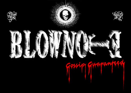
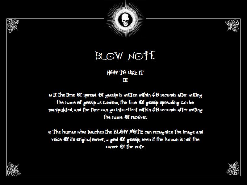
 Gossip box
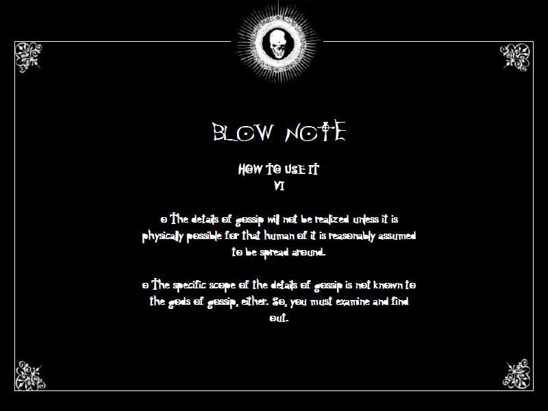
 Gossip Counter


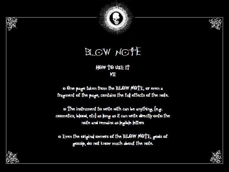
沒有留言:
發佈留言